


Ding! My phone lit up with a text notification of an RSVP link from “my bestest bestie.” A birthday invitation. My heart skipped a beat. I can finally escape the dreary, monotonous cycle of “schoolwork, meals, and sleep” for a couple of hours! Fast forward to the day of the party; I was warmly welcomed by friends and classmates. Waves of laughter. Conversations. Clinking spoons and plates. I fully immersed myself in the lively yet carefree atmosphere, treasuring the rare time without the constant bother of work. Well…that is until the gift-opening process started. One by one, the presents were unraveled and stylish letters with elegant lettering and aesthetic decorations appeared before my eyes. It was at this pivotal moment when I realized the utmost importance of this seemingly useless skill—styling cards.
No matter how well you’re able to convey your heartfelt appreciation to the recipient of your card, without eye-catching styling paired with elegant lettering, it’s likely that your card will end up abandoned in a dusty pile at the bottom of a desk drawer. Forgotten. It’s a state that nobody hopes to see their cards in, yet this remains the inevitable outcome that seems, time and time again, to fall upon the masses of hastily scribbled low-effort cards. At this point, you may already be wondering: is there truly no cure for this card-writing conundrum? Despair no longer, dear reader, for you are in safe hands! The Quill finds it imperative to assist in all matters big and small, with card-writing being no exception. Acquiring only the finest techniques from both research and personal experience, we now present the unsurpassed, fail-proof formula for styling any card.
Type of Card
Selecting an appropriate card is like building a strong foundation, and it requires detailed consideration to arrive at the ideal option. Whether you decide to buy or make your card, it’s always important to consider the occasion. It’s probably for the better that the thank-you card to your teacher doesn’t depict a big cake with the words “Happy Birthday.” Likewise, you must consider the recipient and your personal connection to them. Are they a family member, close friend, or simply an acquaintance? The cost of your card should reflect this connection, similar to spending the appropriate amount on a gift. It’s only natural that cards written to mentors or people you are closer to require far more care and attention, and it’s helpful to use your understanding of them to aid your choices when buying or making your card. Remember, a little creativity can go a long way.
Themes
Themes. Your biggest opponent in English. The number one cause of all your lost brain cells. Sorry if we scared you, but we didn’t mean that. Don’t worry; as bad as it sounds, themes in card styling will surely become effortless with our professional advice. A careful selection of an appropriate theme can turn your otherwise chaotic, jumbled, and mundane card into an organized, aesthetically pleasing, and eye-catching one.
For those writing birthday cards or appreciation letters, the key to determining the right theme lies in your impression of the recipient. The theme of your card should reflect the recipient’s personality, character, and the overall vibe they give off. The Quill recommends a two-step, color-element approach: first, find a fitting color scheme or color combination and, then, incorporate a concrete element that you often associate them with. By adding an aspect of customizable features—specifically fashioned to suit your recipient—you can be certain that they will be left sobbing from joy.
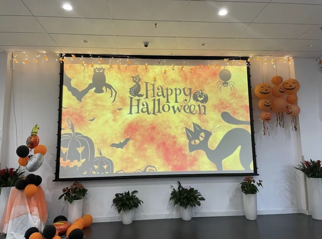
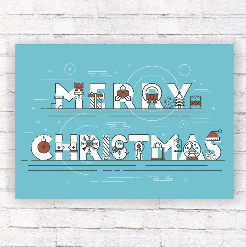
Of course, holidays are also a popular occasion for card writing. Holiday themes can be easily established through our universal color-element formula; now, your card should be customized to fit that specific holiday. Since we’ve already led you through all the basics, let us lead you through a step-by-step example! Take Valentine’s Day, for instance. Close your eyes and imagine a vivid scene for the word “Valentine’s Day” in your head. What do you first think of? The Quill envisions a surprise proposal with a flower bouquet laid on the table and rose petals all over the floor. Great! What is the most commonly used color in your visualizations? The dominating color scheme in our imaginative Valentine’s proposal is red and pink, so that will be the primary colors for our card. Hmm…still seems a bit bland. Then, think of a color that will complement your colors according to your preference. The Quill wants white. And…we’ve got our colors settled! Moving onto the “element” part of our technique…recall your scene again and find a physical object that is of noticeable significance. For us, it would be flowers, in particular, roses. This short, simple process successfully set up the foundational theme of our card: a red, pink, and white color combination, with flowers and roses as the physical components. This may seem like a meaningless activity, but don’t underestimate this formula’s abilities! Next time, try this method on your teachers and your desired recommendation letter will be on its way in no time.
Ultimately, whatever theme you decide to choose—whether based on the recipient or the occasion—be sure to follow through with your theme until the end, or else your efforts may all be wasted!
Lettering
Decorations are certainly not the only way to enhance your card; the words in your heartfelt letters can certainly also be styled with personality! The wide diversity of lettering styles contains any font that you can possibly imagine, and with countless fonts to choose from, there is no need to worry about finding the perfect match for your recipient. A simple Google search and a myriad of choices will appear right in front of your eyes within seconds. Although calligraphy can be overwhelming at first, with the help of YouTube tutorials, even beginners can produce elegant, aesthetically styled letters! It is, indeed, the easily-mastered, cost-efficient, and time-saving features of lettering that make it an irresistible tool when styling cards. However, if you find your letter in critical condition after having a faulty stroke, do not fear! A simple sticker, a topic described in great detail right after this paragraph, will solve all your despairs. We recommend the website FontSpace, which can generate fonts with your own input of words. (Font Style Finder | FontSpace) You can choose to letter anything, anywhere. Now, go foster your creativity and dive into the realm of lettering!
Stickers
Stickers are a fun and inexpensive decoration to add to any card. A single peel-and-stick can upgrade a card from plain boring to expressive, imaginative, and of course, stylish. Doubting your art skills? With the hundreds and thousands of stickers available on the market today, your only concern should be selecting the right ones! From dot stickers to pop-up stickers to holographic ones, the options are seemingly endless, and determining the right ones to use on your card becomes all the more crucial. We advise that you choose one or two larger keynote stickers (think Christmas trees for Christmas cards) as well as a couple of smaller stickers that complement the main colors of your card. If you are unsatisfied with your stickers individually, a cool trick The Quill recommends is to layer some stickers on top of each other to create a desired look. Although stickers can indeed elevate the visual appeal of your card, we caution against using them excessively, resulting in a tacky and unfashionable look.
Drawing
Drawings are a fantastic way to communicate your thoughts and intentions to someone visually. It’s no surprise that they work well in cards paired with beautiful lettering. We are aware that not everyone may be an artistically inclined individual; however, even a simple, but meaningful drawing can leave a lasting impression in someone’s memory. For example, a cute or funny doodle will surely bring a smile to a friend’s face. On the other hand, a vivid illustration in a love letter is perfect for impressing your crush!
Though you’ve reached the end of this article, don’t let these options limit your creativity! Feel free to include your own design choices or modify the ones here–whatever makes you feel more confident about your card. Remember to take your time, reflect on your feelings, and enjoy the artistic process. We hope these tips and tricks have given you ample inspiration for your next card. Happy card-styling!