


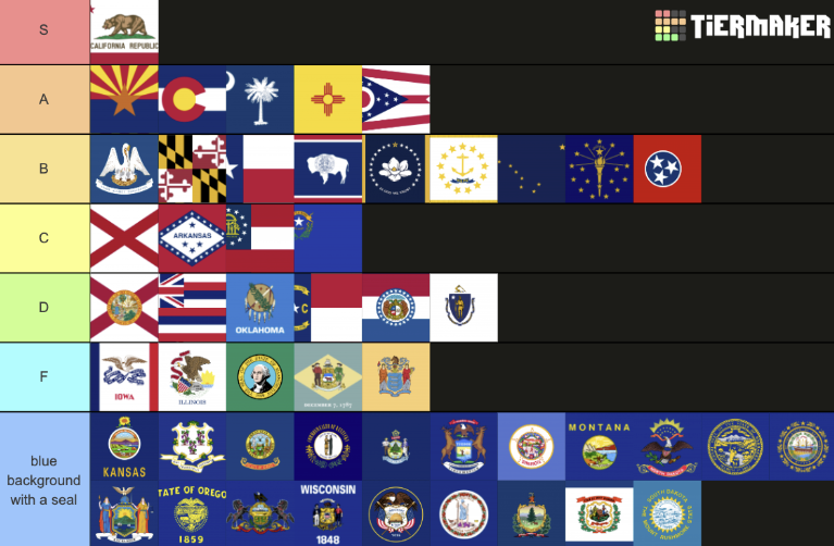
Have you ever sat down and thought about the U.S. state flags, wishing someone would just rank them in an organized tier list with brief explanations? Of course you have! I know this thought is of immense concern to many, so I have graciously decided to share my personal U.S. state flag tier list. Please feel free to argue with me in person if our opinions differ.
The S-tier is reserved for California, of course. While this flag does have words on it– something that most people agree makes flags look less flag-like– they somehow still match the flag’s overall theme. It also helps that these words are “California Republic” despite California no longer being a republic, giving the flag a subtle yet easy-to-appreciate historical detail. This purpose also applies to the bear; California grizzly bears are now completely extinct, but they live on as a symbol. Overall, the flag is easily recognizable, highly symbolic, and aesthetically pleasing, therefore serving every purpose of a flag flawlessly. I am also extremely biased.
In the A-tier, we have Arizona, Colorado, South Carolina, New Mexico, and Ohio (in order from left to right). These flags are all fairly unique and look quite pleasant in their own ways. I like Ohio’s flag in particular because it’s non-rectangular, making it stand out nicely, while it still uses the same colors and patterns as the U.S. flag. While it has its own identity, it is still part of a whole. Colorado’s inclusion in the A-tier may be controversial since it does look somewhat corporate, but it’s still clearly a flag and not a logo. It’s also clearly representative of Colorado– even without background knowledge of state flags, the massive, brightly-colored C will at least help you narrow it down. This helps people recognize the flag with minimal effort and isn’t nearly as tacky as just writing the state’s whole name.
The flags in the B-tier (Louisiana, Maryland, Texas, Wyoming, Mississippi, Rhode Island, Alaska, Indiana, and Tennessee) have been placed here for a variety of different reasons. Flags like Louisiana and Wyoming had the potential to be ranked higher but they were ruined with either words or a seal. The words on Louisiana’s flag are also far too small to read from a distance, even though flags are intended to be recognizable from afar. You don’t need to know what the words say to know what flag it is (which is why Louisiana still makes B-tier), but having the small text there is annoying from a design perspective. Wyoming’s flag frustrates me because its flag could’ve been perfect if not for the overly complex seal in the center. So close, yet so far.
Mississippi also has the small text issue that Louisiana does, but to a lesser extent, since the words blend in with the stars when viewed from afar. Rhode Island has this issue as well, but its stars cannot hide it. The flags of Rhode Island and Alaska may also be difficult to see from a distance due to the size of the stars, and in the case of Rhode Island, the lack of contrast between the yellow stars and the white background. While Indiana doesn’t have these design flaws in particular, it doesn’t meet the standards of the A-tier flags for me. The stars look a bit cluttered, and it seemed wrong to put Indiana in the A-tier but have Rhode Island and Alaska in the B-tier. Tennessee doesn’t have any major issues either, but just isn’t as good as A-tier flags.
Texas finds itself in the B-tier as well; while there’s nothing wrong with the flag, nothing about it stands out to me. The singular star is nice though, being the origin of Texas’s official nickname: The Lone Star State. It also uses the exact same colors as the U.S. flag, similar to Ohio. I personally find the flag to look a bit basic, considering how much personality Texas has. On the other side of the spectrum is Maryland, which has an extremely unique and recognizable design that just doesn’t look good.
In the C-tier, we find flags that are just acceptable: Alabama, Arkansas, Georgia, and Nevada. They may not be good-looking, but at least they still look like flags. Alabama’s flag is just boring, but people have also accused it of being modeled after the Confederate flag, which would certainly move it down a few tiers if proven true; however, there is no evidence suggesting a concrete link between Alabama’s flag and the Confederate flag, so I will be rating it on design alone. Don’t worry, it is still a fairly low rating. Arkansas and Georgia have designs that are a bit more interesting, but also uglier. Georgia does have some good design elements, but they’re in the wrong places. Nevada’s flag has unreadable small text, and the design as a whole is somewhat difficult to see, but at the same time, it is fairly distinct and looks more like a flag than those in the D-tier.
The D-tier (Florida, Hawaii, Illinois, Oklahoma, North Carolina, Missouri, Washington, Delaware, and New Jersey) is where things really begin to go downhill. Florida is just Alabama with an ugly seal slapped on it, and Alabama wasn’t very good to begin with. Hawaii has a British flag on it. Massachusetts and Oklahoma have the same basic format as the bottom tier, but their seals are less ugly so they get to be ranked higher. Missouri uses a similar format as well, but its tricolor design makes it look a little more like a flag. Not only does North Carolina use an uninteresting format and have words on it, but it has numbers on it. These flags are certainly bad, but it gets even worse.
In the F-tier, we have Iowa, Illinois, Washington, Delaware, and New Jersey. Iowa plagiarizes France and includes a copious amount of difficult-to-read writing. Illinois’s flag is somewhat cluttered and does not really look like a flag. Washington, Delaware, and New Jersey have essentially the same generic format as the bottom tier, but their unique colors give at least a little personality.
The next category is the fated blue backgrounds with seals on them. One of these flags isn’t blue, but it doesn’t matter. It’s equally uninteresting and unappealing. I don’t have much to say about these flags because they all look the same.
We conclude this tier list on a low note. But amidst a sea of generic blue backgrounds, you can still come across the rare California grizzly bear. And there is hope for blue backgrounds– Minnesota and Utah are scheduled to switch to much better flags this year. You may be wondering, does any of this actually matter? No, not really. Still, there’s a bit of joy to be found in seeing a very well-made flag, just as there is a bit of joy to be found in making fun of bad ones.